A New Tool for Correlation Analysis
Posted Sunday, September 04 2011
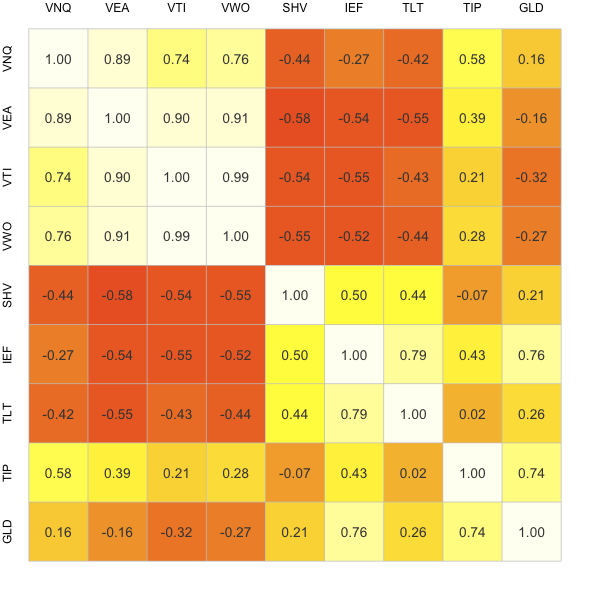
Today I'm launching the Department of Numbers Correlator, a tool for analyzing the correlation coefficients of select ETFs tracking major asset classes. Check out the results:
Correlator Results for the Period from 8/2007 to 9/2011 for Select ETFs


The chart above shows the correlation coefficients calculated from monthly returns of 9 ETFs representing the US equity market (VTI), foreign developed markets (VEA), emerging markets (VWO), US REITS (VNQ), TIPs (TIP), Gold (GLD), Cash (SHV), Intermediate-term Treasuries (IEF) and Long-term Treasuries (TLT). Right now the tool only has 13 ETFs available for correlation analysis, but I intend to add a good deal more after testing things out and hearing your suggestions (my contact info is at the bottom of the page!). Something like Mebane Faber's "expanded list" of asset classes would seem like a good next step.
So what is this correlation coefficient business? In layman's terms, the correlation coefficient describes how the returns for different assets move with respect to one another. A correlation coefficient of 1.0 implies that two assets tend to move in the same direction (though not necessarily in steps of equal magnitude). A -1.0 correlation value suggests that they move in opposite directions. Correlation values of 1.0 or -1.0 are unheard of however. What you see in reality are evolving correlations that range between -1.0 and 1.0 suggesting imperfect interrelationships where one asset tends to move with another (correlation > 0) or against another asset (correlation < 0) to a moderate degree.
I should also point out that I built this tool with R which enables this neat clustering option (enabled above) that groups like assets. For instance, VTI, VEA and VWO are all pretty similar qualitatively (they're relatively highly correlated because they're all larger cap equities). The clustering recognizes this in a quantitative manner and groups these three tickers together when creating the chart. For similar reasons IEF and TLT are placed next to one another as well as TIP and GLD. For much more on the clustering method see the R documentation for hierarchical clustering.
Go try out the correlator yourself here!
Update 1: I added a bunch more tickers.
Update 2: I changed the correlator's methodology (sorry, it's still a beta project folks). I had previously been including dividends in the correlation calculations. Other correlation tools on the web do not do this, so I've decided to remove dividends from the calculation for the time being for consistency sake. I'll add them back in as an option later. The chart above has been updated.
Update 3: More changes! Sorry folks... While the correlation tool previously agreed with the S&P sector tool I referenced in the last update, it turns out that's not really a metric that I want to agree with! The S&P site seems to be using correlation of prices rather than correlation of returns — at least that's what I infer from the results. I think investors are more interested in the correlation of returns (including dividends). I'll lay this all out in a new post eventually, and I'll try to stop flip-flopping so much.

